Project overview
This cross-media campaign identity was designed for the RMIT VEGA 2026 Mid-Year Showcase. It needed to work across printed posters, social media and short video, helping students, staff and the public understand the event quickly while still conveying the energy of a student exhibition.
Core concept
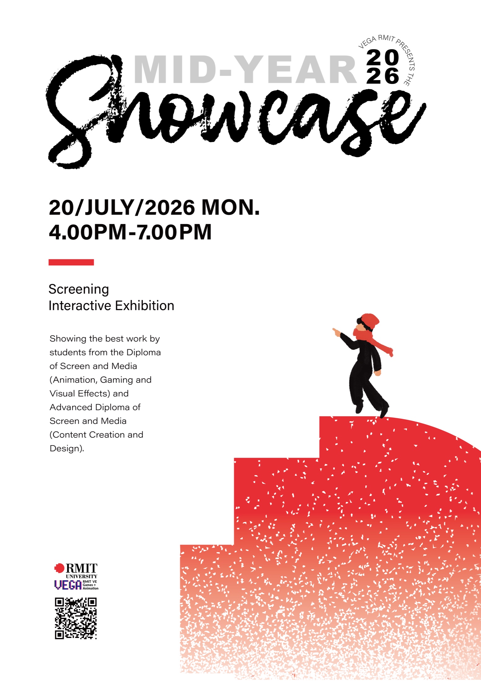
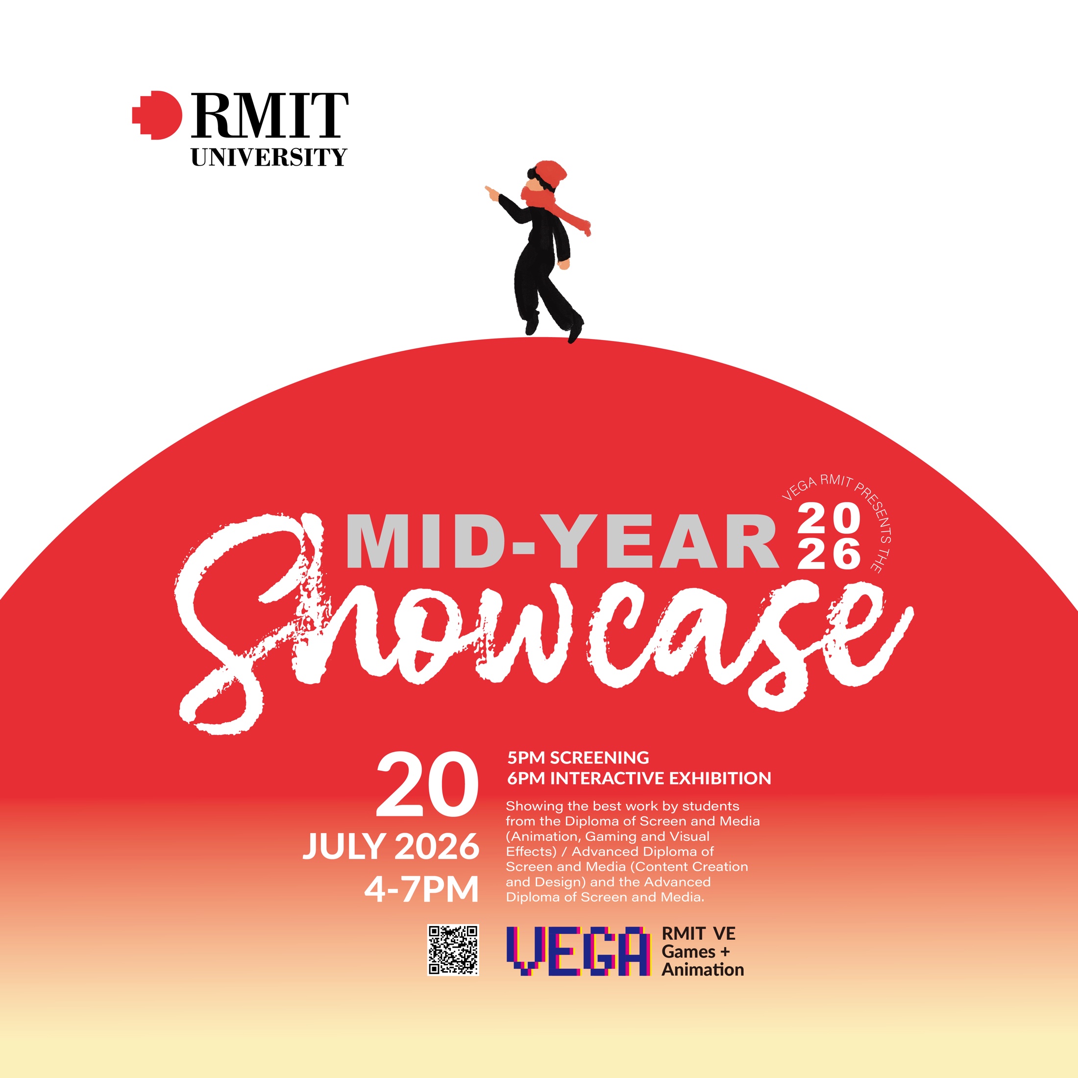
The first direction extracts a geometric corner from the RMIT mark and turns it into a staircase rising through the composition. Hand-drawn figures standing on the steps represent students in the process of growing, while the school's brand structure becomes the platform supporting their next stage.
The layout centres on black, white and RMIT red. Large brush lettering, open space and a clear information hierarchy keep the result controlled. Grain on the staircase fades as it rises, suggesting upward movement and drawing visual weight from the bottom of the poster towards the figure.
Exploring directions
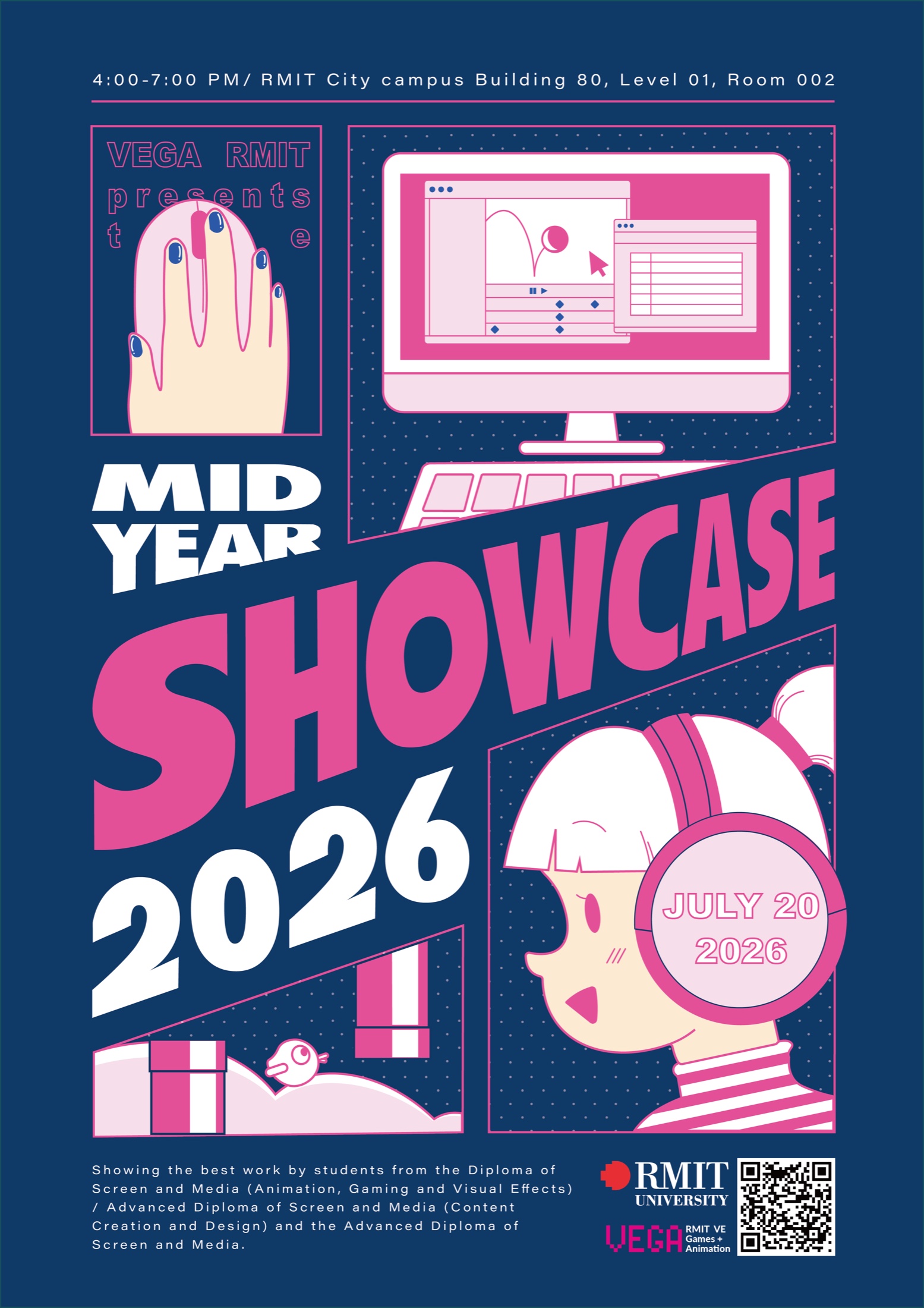
A second proposal uses deep blue and saturated pink, combining an animation interface, headphones, illustrated characters and an angled headline to create a more digital-media-led identity. The two directions test a conceptual metaphor against the feeling of making work inside the media itself, helping me compare recognition across different audiences and channels.
Cross-platform extension
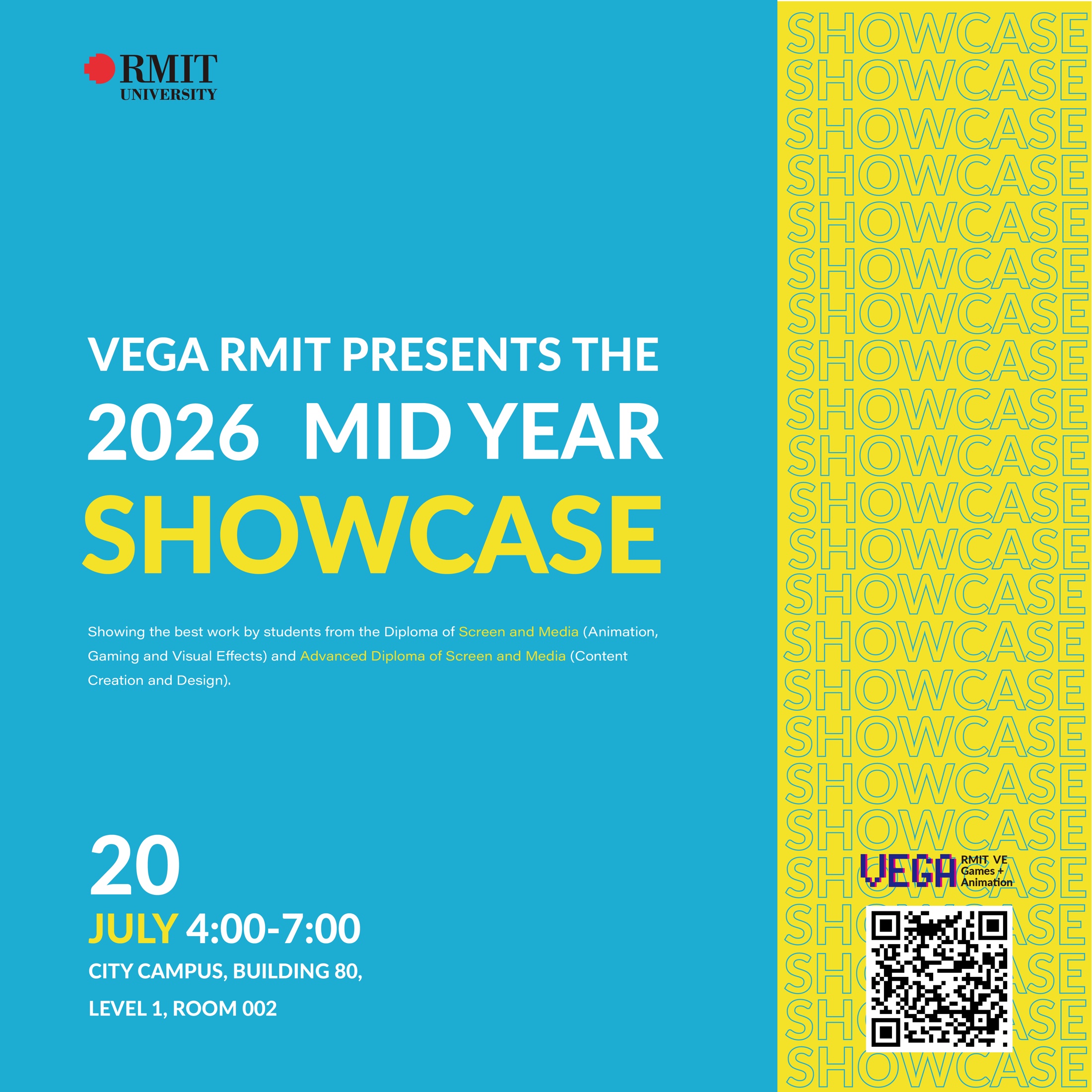
The poster system was adapted into square social layouts and a 7.6-second motion sample. The animation moves the figure up the staircase while changes in the particles reinforce the rhythm of growth. A future extension could include a vertical short-video version or an AR layer that lets audiences scan the poster to see the character and particles move.
Reflection
This exercise made me more deliberate about placing concept, brand assets and information hierarchy inside one system instead of treating illustration and typography separately. Course feedback recognised the consistency across print, video and social formats. In another iteration, I would simplify small information further and establish stricter layout rules for different viewing distances.