Project overview
Melbourne's tram network is more than a public transport system; it is part of the city's visual identity. This project edits a large body of historical research into an accessible timeline, using tram illustrations, key statistics and comparison graphics to tell the story of change from 1884 to today.
Information strategy
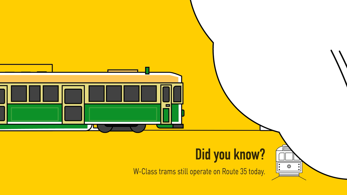
The source material contained many dates, vehicle types and network figures, while the final animation could last only around twenty seconds. To reduce cognitive load, I selected four stages—horse and cable trams, electrification, low-floor vehicles and the modern network—and made the tram itself the visual timeline running through the poster.
Saturated yellow gives the system a clear and consistent identity. Black-and-white line drawings keep vehicles from different eras within one visual language, condensed display type establishes hierarchy, and charts and icons handle quick comparisons.
Motion extension
The motion version breaks the static poster into a sequence of shots. Trams travel horizontally while dates and data appear with the movement. I focused on balancing the rhythm of information, transitions and enough time for each detail to be read.
The project showed me that a strong transition cannot come at the expense of comprehension. Future versions would hold text on screen for longer and refine the relationship between voice-over, sound and timing.