Project overview
This awareness campaign centres on cycling to school. It uses a light, approachable animation language to discuss the morning commute, urban peak-hour traffic and safer ways to ride.
The story follows an animal character cycling through the neighbourhood. Both character and environment grew from my own hand-drawn linework, with real streets simplified into a more rhythmic illustrated space.
Visual exploration
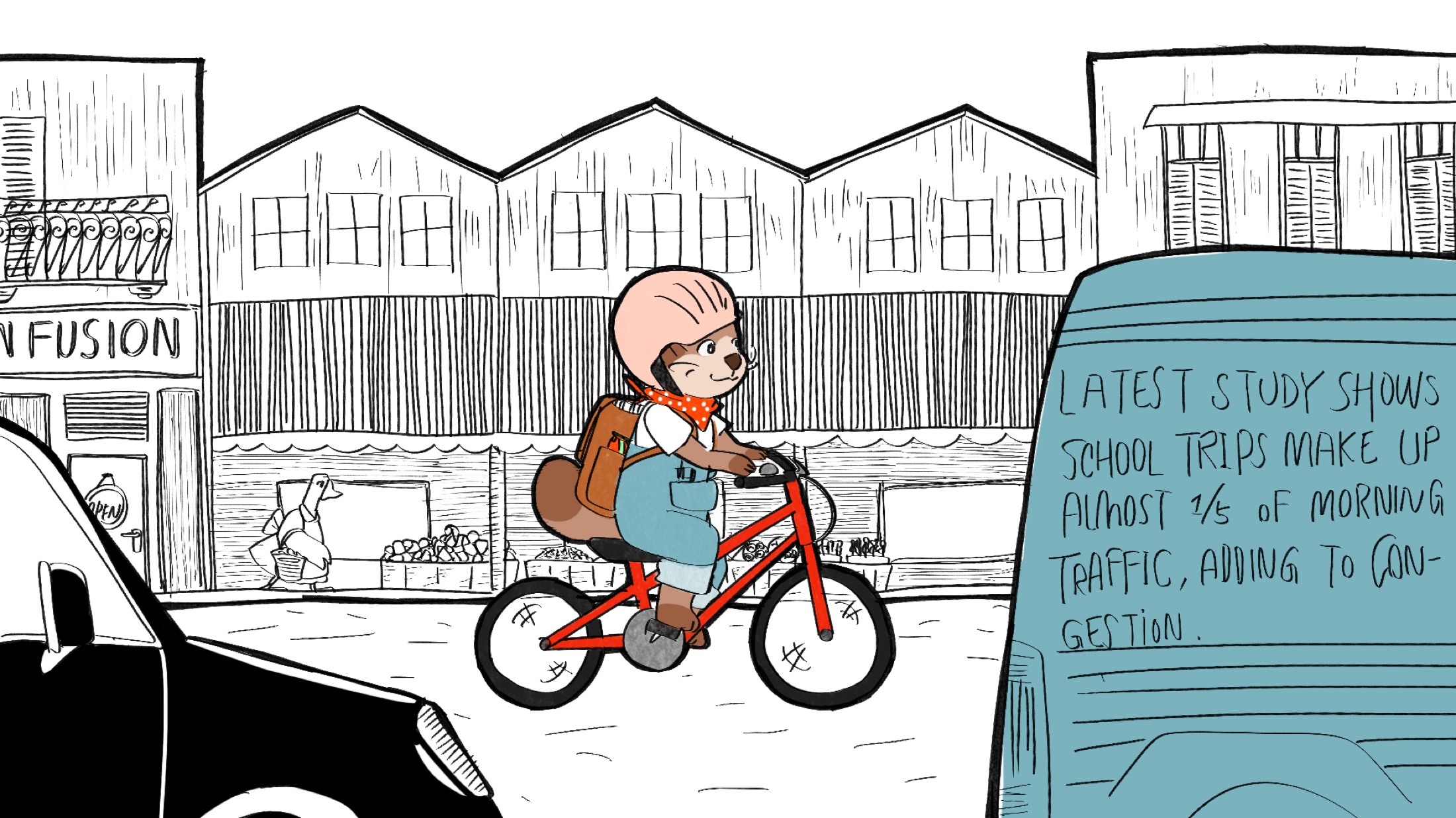
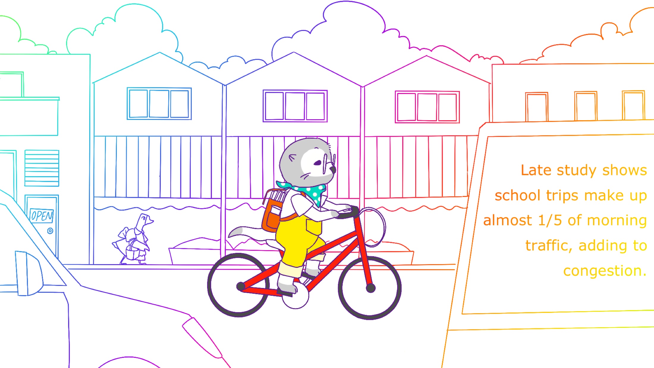
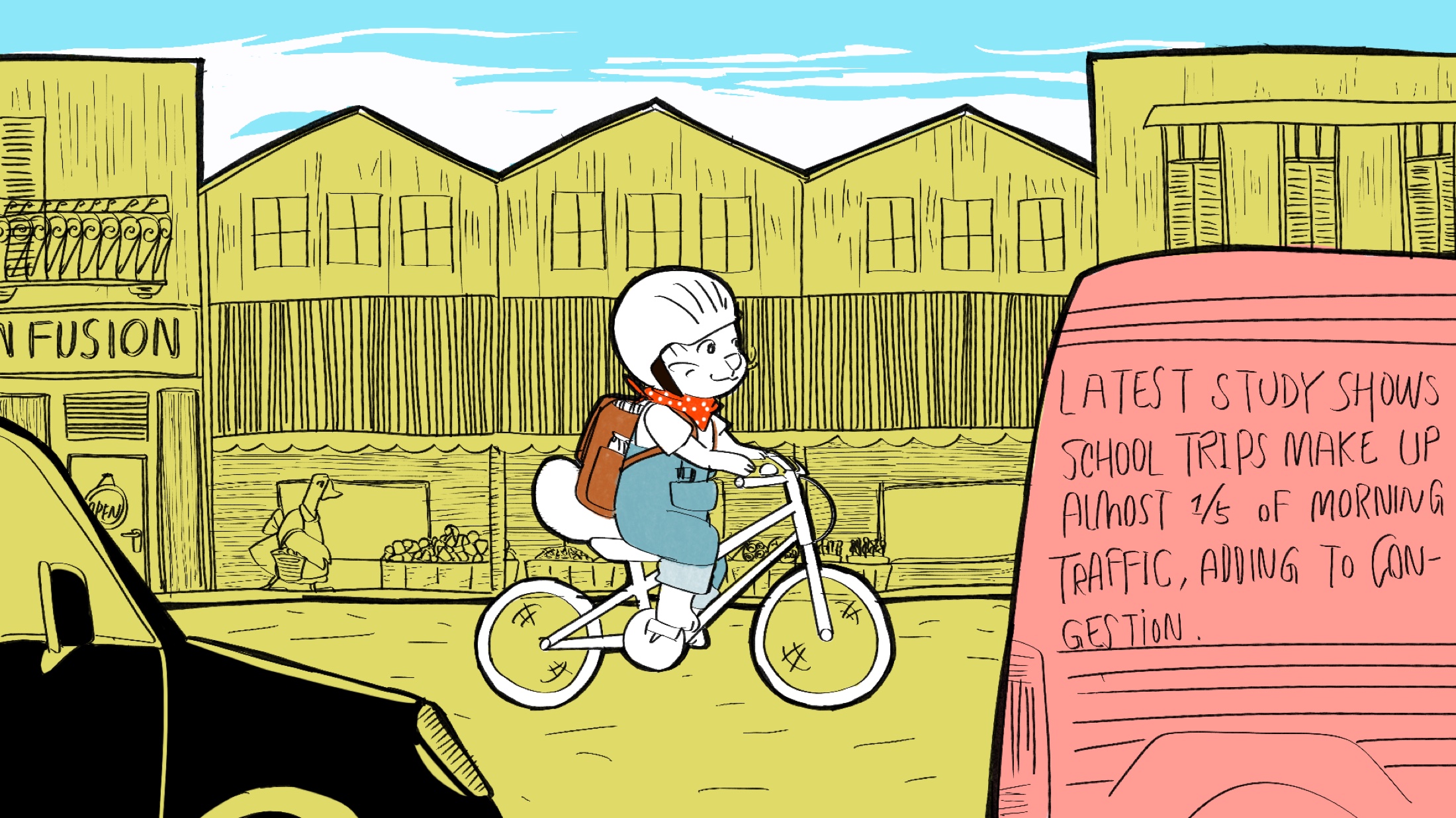
I created five early style frames to compare different colour systems: a black-and-white environment with only the character highlighted, high-contrast flat backgrounds, a fully coloured storybook treatment and an experimental version made from gradient linework.
The aim was not simply to choose the most attractive image, but to test which direction best balanced a young audience, communication clarity and production time. The final direction keeps the irregular character of the drawings while separating foreground figures more clearly from the background.
Iteration and reflection
Feedback showed that the early storyboard relied too heavily on wide shots and felt visually flat. I introduced medium shots and close-ups, then tested transitions between the different colour treatments. The process made me more attentive to shot variation, clarity of information and the balance between personal style and a campaign's communication goal.