Reflection on John Ford’s presentation
Last weekend, I was sitting on the grass at the Royal Botanic Gardens in Melbourne. Around me, people were carefully posing for photos. Some had brought reflectors, dressed specifically for the shoot, and kept adjusting their position to find the right light and angle. It was such an ordinary scene that I almost ignored it, but it made me think about how common this behaviour has become. Why has going somewhere become so closely connected to producing an image of being there?
At first, I was thinking about this mainly in terms of motivation and reward. A travel experience can be quite vague. I can spend several hours walking, looking at scenery and moving through a place, but afterwards it can be difficult to say exactly what I “got” from it. A photograph is different. It is concrete. It becomes a result, a memory, something that can be shown to other people. In a very simple way: I have something to show for it.
John Ford’s presentation gave me another way to think about this question. Guy Debord’s idea of The Society of the Spectacle made me realise that the issue is not only about individual behaviour. Spectacle is not simply a collection of images, but also a way in which social relationships become mediated through images and representation (Debord, 1967/1994). What stayed with me most was the idea that representation does not always come after an experience. It can begin to shape the experience before it even happens.
A place can already exist in my mind as an image before I physically arrive there. I may know what angle people normally photograph, what kind of clothes are associated with the location, where I am expected to stand, and what kind of image is considered “good”. In that situation, the photograph is no longer simply a record of the experience. It starts to organise the experience itself.
This changed the direction of my question. Instead of only asking, “Why do people behave like this?”, I started asking, “What kinds of systems and design decisions encourage this behaviour?”
From a designer’s point of view, this becomes important. If contemporary culture rewards experiences that are easy to photograph, share and circulate, designers will naturally become aware of that. A light festival, for example, is not only creating an experience for the people physically standing inside it. It is also producing images that continue to circulate through social media, tourism advertising and news coverage after the event is over.
I do not think this is automatically a bad thing. Visibility and circulation have real value. If an artwork communicates something beautifully but nobody ever encounters it, that creates another problem. Design is not only about expressing something for myself. At some point, another person has to receive it, respond to it, or experience it.
So the question that became more interesting to me during the class was:
What am I optimising for when I design an experience?
Am I trying to create a powerful experience for someone who is physically present? Am I trying to make something that communicates clearly through an image? Am I trying to reach as many people as possible? Am I trying to create a particular emotion or communicate an idea? These goals can overlap, but they are not always the same.
The discussion of concentrated, diffuse and later integrated spectacle (Debord, 1967/1994; 1988/1990) also made me wonder whether a concentrated idea can now circulate through much more diffuse, everyday forms. A serious or ideological message does not necessarily have to appear as something monumental or obviously serious. It can move through entertainment, short videos, humour, repetition or ordinary media. For my own work, this made me think that a large theme also does not necessarily need a large or direct form.
But once a work starts adapting itself to the forms that circulate most easily, another problem appears. The question can gradually change from “What experience am I trying to create?” to “What will attract attention?” or “What will look good in a photograph?”
This connected with the discussion about artworks that can be reproduced from city to city compared with work that is deeply connected to a specific place. A glowing tunnel may be visually impressive, highly photographable and easy to reproduce in different cities. A site-specific work connected to a damaged tree, its history, the location and the position of the viewer may be much harder to reproduce. I do not think one is automatically better than the other. A reproducible work may be easier to tour, promote and make accessible to more people. A site-specific work may create a deeper relationship with a particular place. They are making different exchanges.
What matters to me is whether those decisions are intentional.
The question raised in class about whether art can ever truly stand outside spectacle, or whether new forms of art will eventually be absorbed by capitalism, also stayed with me. I am not sure complete escape is even a useful goal. Even critical art still needs audiences, exhibitions, institutions, documentation and some form of circulation in order to be seen. For me, the more useful question is how to remain conscious of those systems while working inside them.
This becomes even more interesting when I think about the title of our course, Heightened Multisensory Experience. The course is called “Experience”, but throughout the semester we are also constantly working with representation. At the beginning, we present a brief and try to communicate an experience that does not even exist yet. During work-in-progress presentations, we explain what we are developing. At the end, we show the finished work to teachers and classmates.
So throughout the course we are constantly moving between:
what I intend → how I represent it → what the audience actually experiences.
These three things are not always the same. I might say in a presentation that I want my work to feel anxious, repetitive or overwhelming. People can understand what I mean because I have explained it. But if I remove my explanation, can the work itself still communicate that feeling?
There is a difference between explaining an experience and designing an experience that communicates by itself.
At the same time, representation is still necessary. We need language, images, references, documentation and presentations in order to communicate work to other people. A multisensory experience may depend on sound, movement, space, time or the body, but at different stages we still have to translate parts of it into forms that can be shared. This creates a tension that I now find very interesting: the experience needs to be communicated, but the act of communicating it can also start to reshape the experience.
Although John Ford’s presentation focused on lighting, I think this design logic is directly relevant to my animation practice. Lighting can guide attention and emotion through brightness, colour, contrast and scale. Animation can do something similar through movement, rhythm, sound, framing, repetition and time. In both cases, the designer is shaping how another person experiences something.
So the main question I want to keep from this class is not whether I should embrace spectacle or reject it.
It is:
How can representation serve the experience rather than replace it?
If I saw the same people posing for photographs in the Botanic Gardens again, I do not think I would simply ask why they care so much about getting a good photo. I would probably also start looking at the space around them: how the location encourages that behaviour, how the image they want may have existed before they arrived, and how design participates in turning an experience into something that can be seen and circulated.
For my own work, I want to keep asking the same thing: what am I actually asking the audience to experience, how am I communicating that experience, and at what point does the need to represent it begin to change the experience itself?
References
Debord, G. 1994, The Society of the Spectacle, trans. D. Nicholson-Smith, Zone Books, New York. Originally published 1967.
Debord, G. 1990, Comments on the Society of the Spectacle, trans. M. Imrie, Verso, London. Originally published 1988.
In-Class Exercise: Lighting Angles
For this exercise, I used the same small cat figure and changed only the direction of the light. Because the cat stayed in almost exactly the same position, it became quite easy to see how much the lighting alone could change its mood and personality. I also took one image under normal ambient light as a comparison.
Ambient Light — Comparison
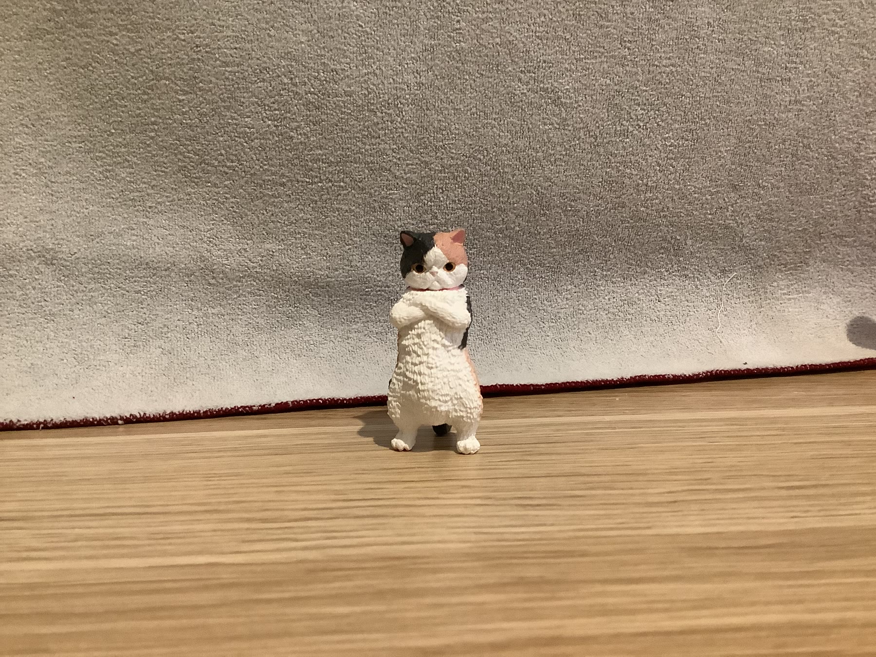
With the main room light turned on, I can see almost everything: the cat’s face, body, the floor and the surrounding space. It feels the most ordinary and natural, but because everything is visible at the same time, there is less visual focus.
Front Light
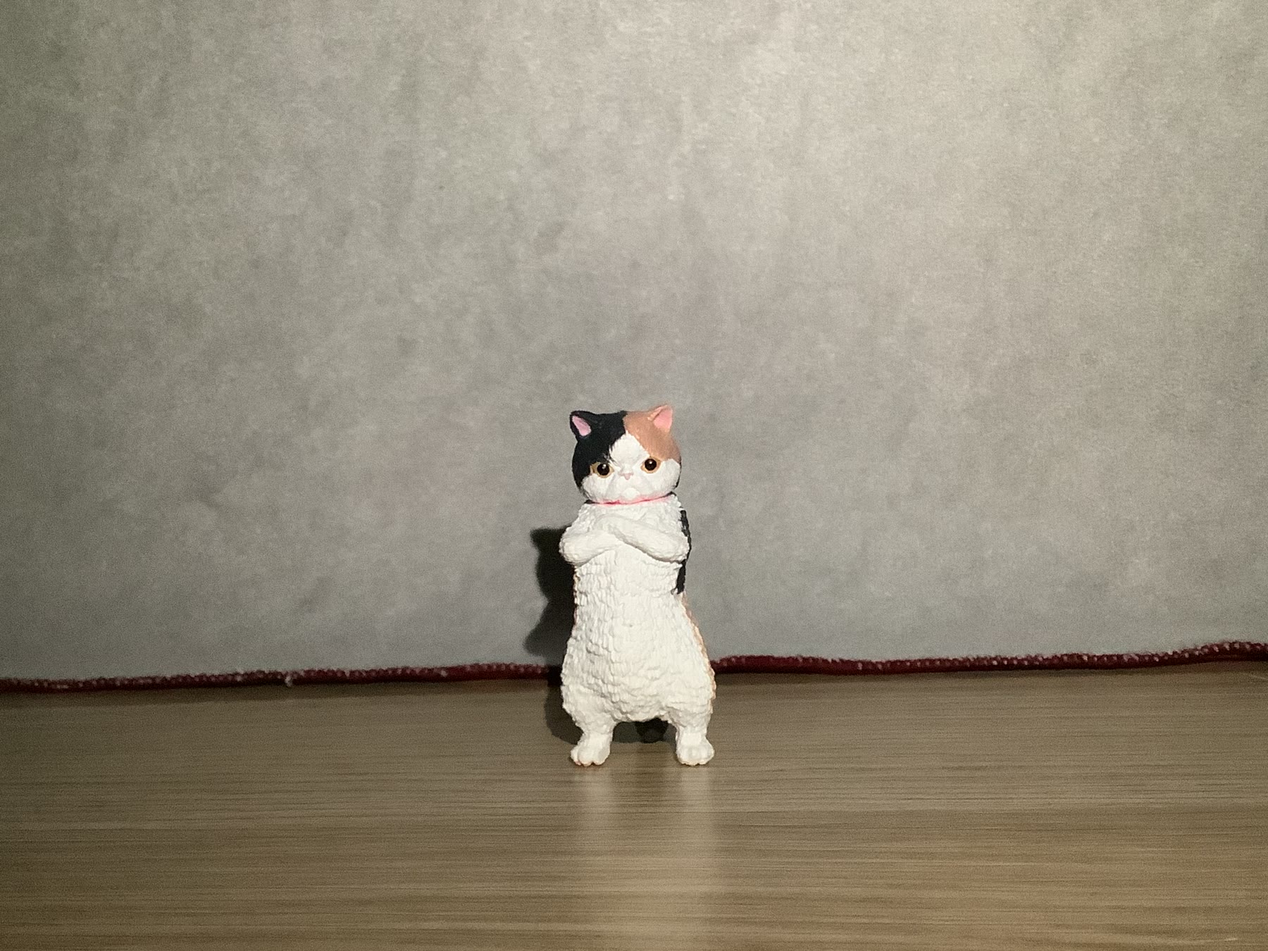
In this image, the cat is completely exposed to the viewer. I can clearly see its angry little face, crossed arms and most of the details on its body, so even though it looks slightly grumpy, it still feels quite cute and direct rather than mysterious.
Top Light
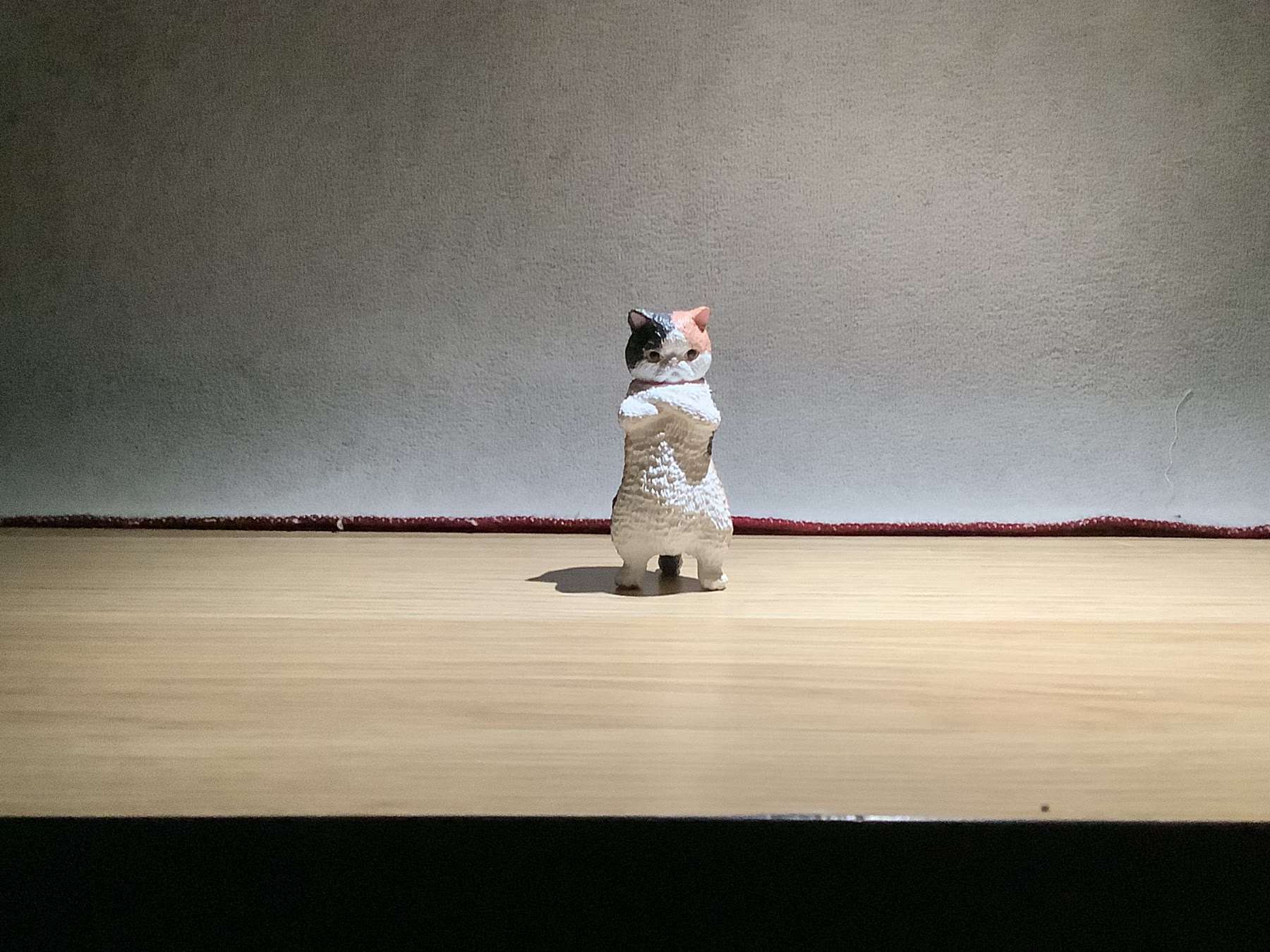
Here, the top of the cat’s head, ears and body are very clear, while parts of the face fall into shadow. It reminds me of stage lighting because the light creates a clear area of focus and gives the cat more shape, even though some facial details are harder to read.
High Side Light
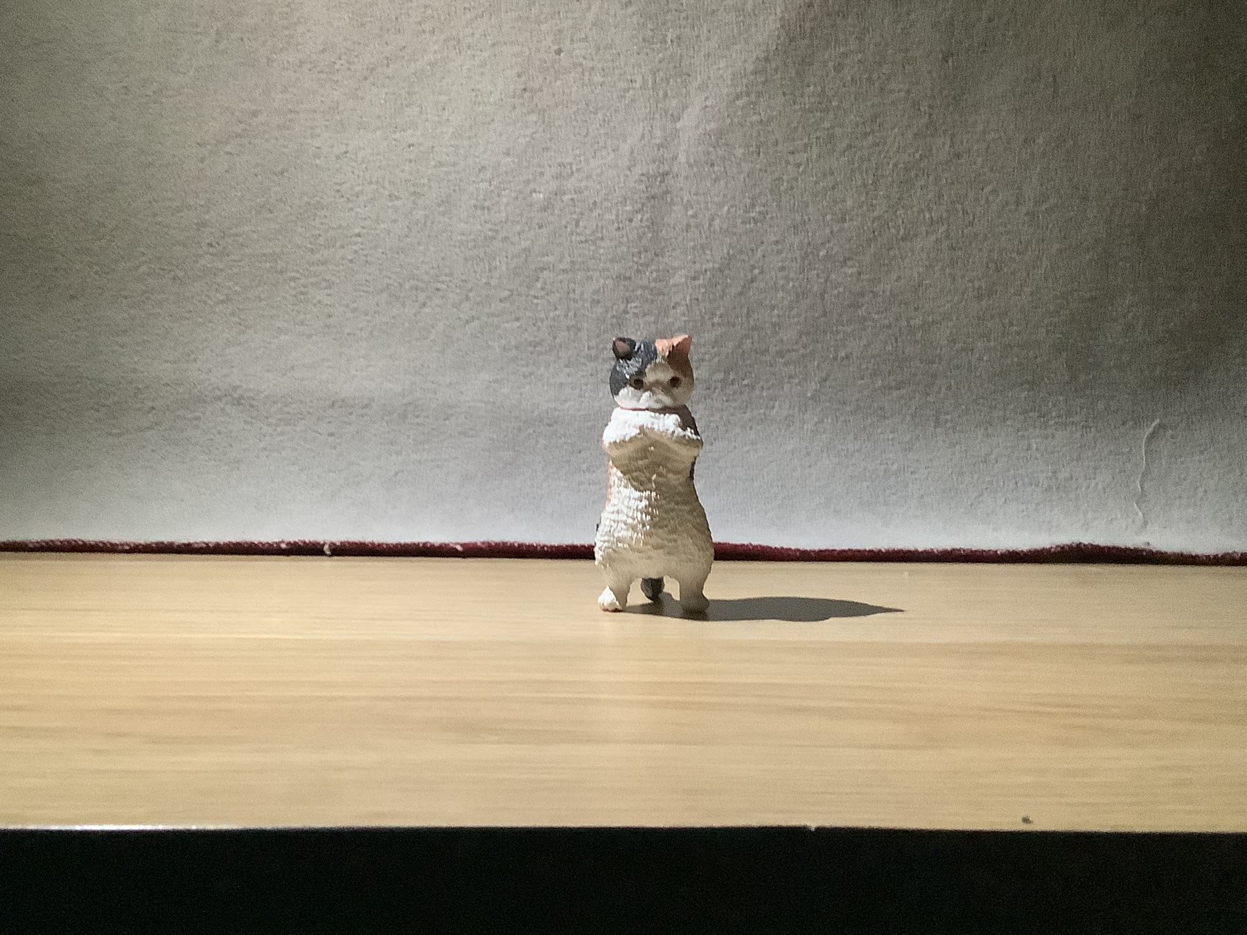
The light comes down from one upper side, so one side of the cat becomes brighter while the other gradually falls into shadow. I like how this makes the little figure look more three-dimensional and gives its surface and shape more definition without hiding the face too much.
Side Light
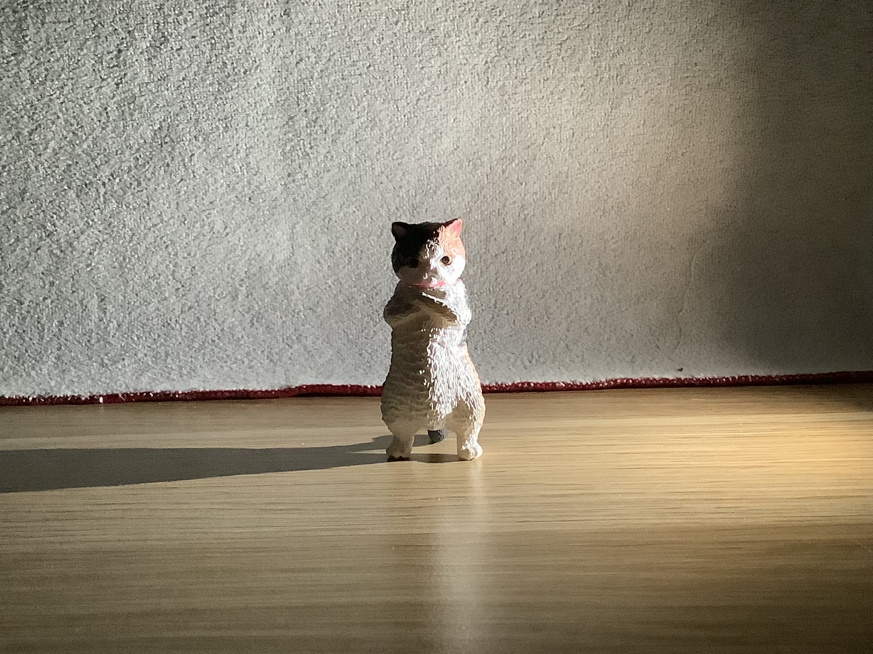
This image divides the cat almost directly into a bright side and a dark side. The same expression suddenly feels much less simple, because part of the face is visible while the other part is hidden, making the cat feel more ambiguous and difficult to read.
Back Light
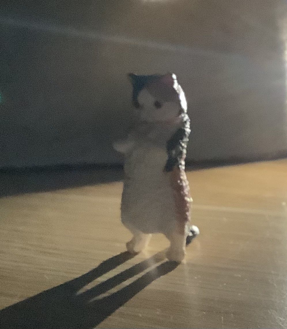
This image was technically harder to photograph, so the light source is more visible than I wanted, but I can still see the bright outline around the cat and the long shadow stretching towards the camera. The face becomes much less important and the silhouette becomes stronger, which gives the cat a more distant, lonely and slightly heroic feeling.
Up Light / Underlighting
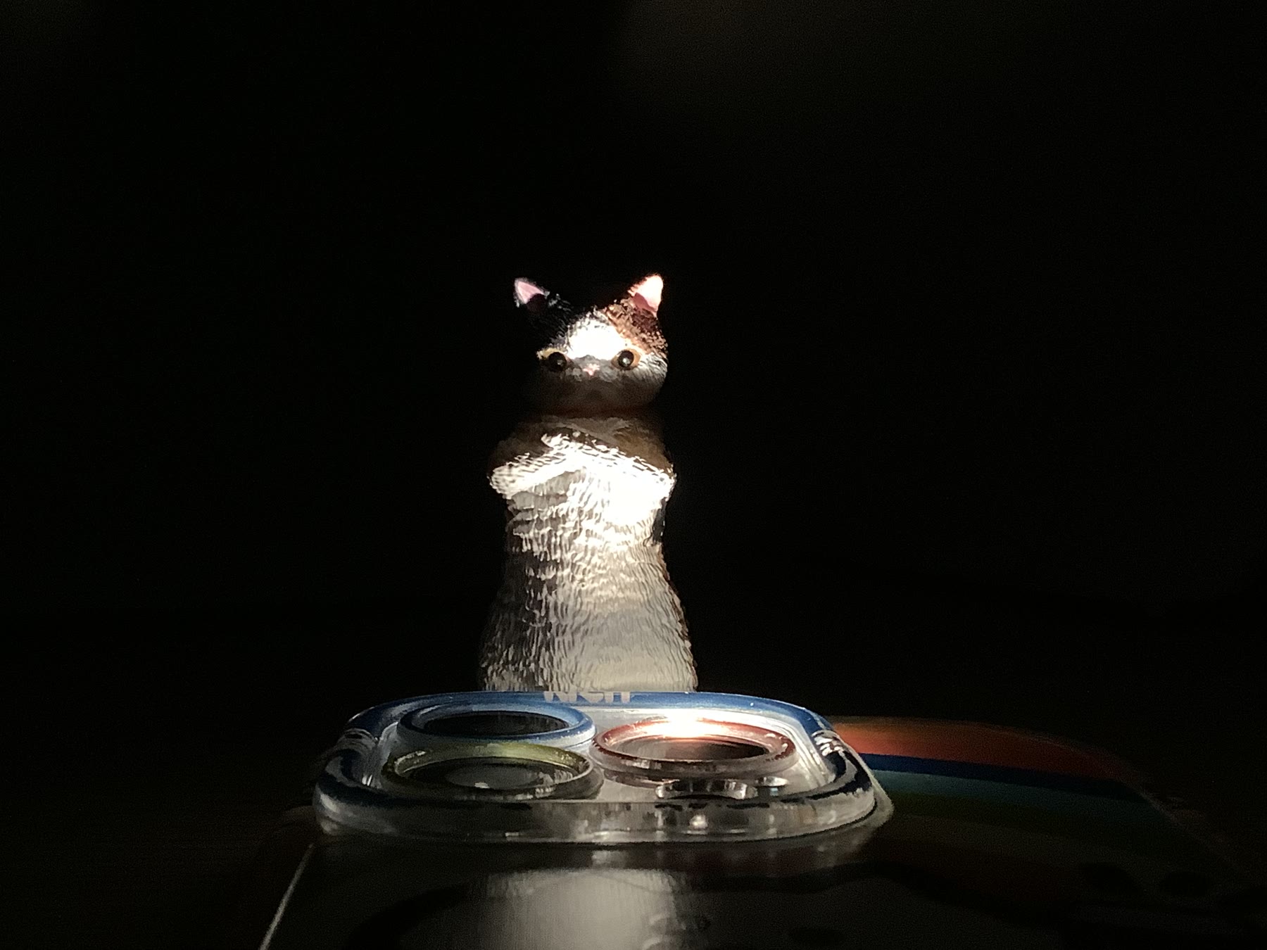
This is probably the biggest change in character. With the light coming from below, the shadows sit in places where I am not used to seeing them, and the same angry cat that looked quite cute under the front light suddenly looks like a small villain from a horror film.
Looking back across the six images, I noticed that most of the lighting angles gave the cat a fairly clear mood. The side-light version stayed with me because its mood felt less settled and more open to interpretation.
My Favourite: Side Light
What I like most about this image is how directly the lighting changes the way I read the cat. Nothing about the figure itself has changed, but the half-lit, half-hidden face immediately makes it feel more complicated.
I have seen this kind of lighting quite often in films when a character is difficult to judge—someone whose intentions are unclear, an undercover character, or someone moving between a “good” and “bad” side. The bright and dark halves become a simple visual metaphor for that uncertainty. I like that the image can suggest all of this without changing the cat’s pose or expression at all.
Overall, this experiment made the effect of lighting feel much more concrete to me. I used exactly the same little cat each time, but simply moving the light was enough to make it feel cute, neutral, mysterious, heroic or threatening.
AI Acknowledgement
ChatGPT was used to help organise my notes and draft, and refine the clarity of the English writing.